LAYOUT
Key Concepts in Positioning Elements
- Building Blocks CSS treats each HTML element as if it is in itsown box. This box will either be a block-level box or an inline box.
- Block-level elements start on a new line Examples include: < h1> < p> < ul> < li>
- Inline elements flow in between surrounding text Examples include: < img> < b> < i>
-
Containing Elements If one block-level element sits inside another block-level element then the outer box is known as the containing or parent element.
-
Controlling the Position of Elements :
-
Normal flow (position:static) In normal flow, each block-level element sits on top of the next one. Since this is the default way in which browsers treat HTML elements, you do not need a CSS property to indicate that elements should appear in normal flow, but the syntax would be: position: static;
-
Relative Positioning (position:relative) Relative positioning moves an element in relation to where it would have been in normal flow.
-
Absolute Positioning (position:absolute) When the position property is given a value of absolute, the box is taken out of normal flow and no longer affects the position of other elements on the page. (They act like it is not there.)
-
Fixed Positioning (position:fixed) Fixed positioning is a type of absolute positioning that requires the position property to have a value of fixed
-
Articapping Elements (z-index) If you want to control which element sits on top, you can use the z-index property. Its value is a number, and the higher the number the closer that element is to the front. For example, an element with a z-index of 10 will appear over the top of one with a z-index of 5.
-
Floating Elements (float) The float property allows you to take an element in normal flow and place it as far to the left or right of the containing element as possible
Liquid Layouts
Liquid layout designs stretch and contract as the user increases or decreases the size of their browser window. They tend to use percentages.
## Advantages
● Pages expand to fill the entire browser window so there are no spaces around the page on a large screen.
● If the user has a small window, the page can contract to fit it without the user having to scroll to the side.
● The design is tolerant of users setting font sizes larger than the designer intended (because the page can stretch)
Disadvantages
● If you do not control the width of sections of the page then the design can look very different than you intended, with unexpected gaps around certain elements or items squashed together.
● If the user has a wide window, lines of text can become very long, which makes them harder to read.
● If the user has a very narrow window, words may be squashed and you can end up with few words on each line.
● If a fixed width item (such as an image) is in a box that is too small to hold it (because the user has made the window smaller) the image can overflow over the text.
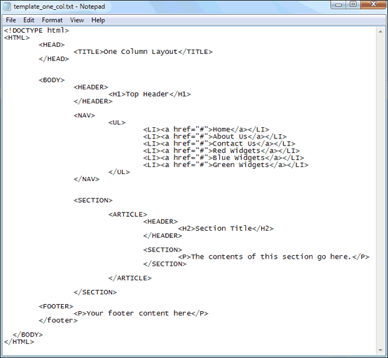
Example